In 2015, mobile phones overtook desktop computers as the primary device people used to search the web, and, according to Google, users are five times more likely to leave a website if it isn't mobile-friendly.
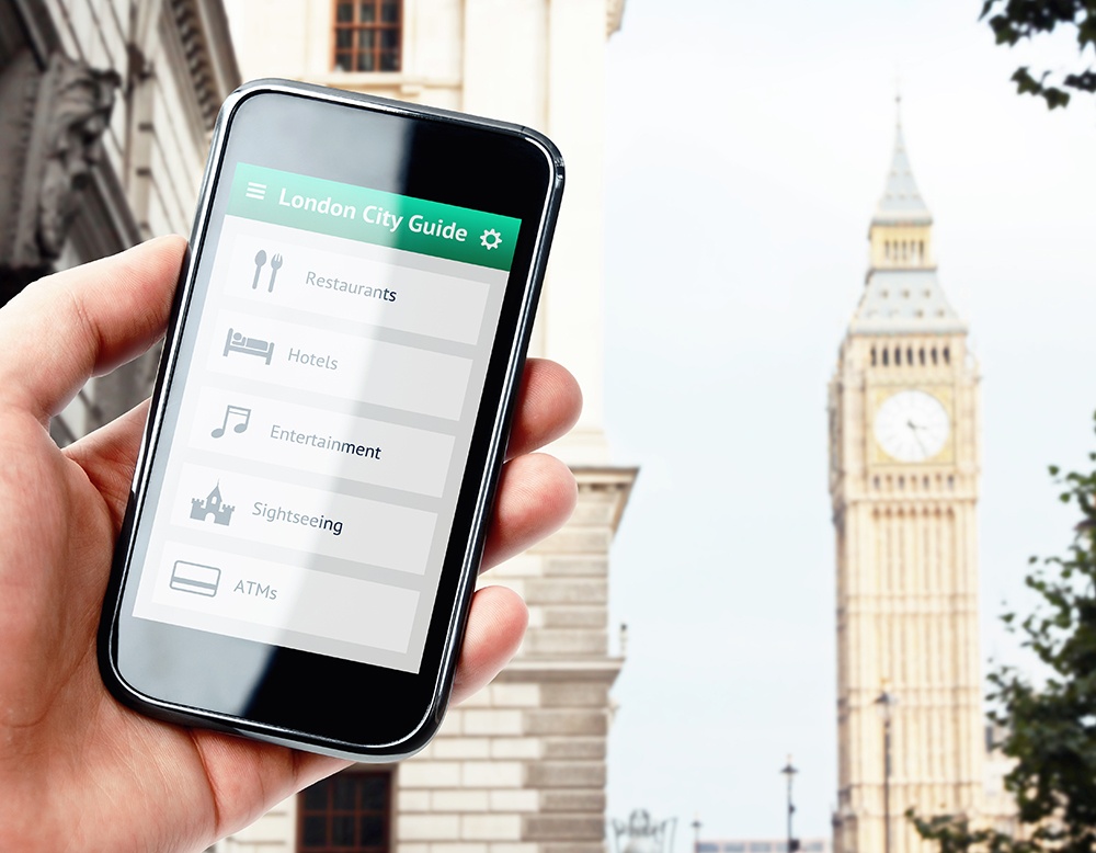
It’s imperative for hoteliers to fully understand the benefits of optimising their online marketing efforts for mobile, or run a very serious risk of alienating potential guests and losing business.
Luckily, this process is not rocket science. We’ve put together a handy high-level ‘cheat sheet’ you can use to help ensure your transition into the world of mobile is as smooth as possible.
Profile of a mobile user
First, let’s consider what a mobile user wants out of their browsing experience. A team of researchers at Google and AnswerLab conducted a series of in-person studies with different focus groups, asking them to complete tasks like make a purchase, book a hotel room and conduct research on their own cell phones.
Their most important findings showed that:
- Mobile users are very goal-orientated (make sure that call-to-action button is always visible)
- They expect to get what they need from a site easily, immediately and on their own terms
- Businesses will ensure success by designing a mobile-friendly site with these needs in mind, but without sacrificing richness of content
Smartphone bookings are rising around the world, and hotels remain the subsector in which smartphone bookings are most common, generating one in five online bookings in Q2 2016. – Travel Flash Report, October 2016 edition, Criteo
Common frustrations for mobile users
According to technology solutions company Leonardo, some of the most common frustrations for mobile users on hotel or booking websites include:
- Tiny, hard-to-read text forcing you to pinch and zoom
- Large visuals that load slowly
- Pages that stretch beyond the width of your screen, requiring you to scroll around
- Small links that are difficult to click with your finger
- A frustrating booking process
- No clear links or functionality to quickly connect with the hotel
- Pages originally optimised for desktop browsers that take a long time to load on mobile
- Overall, an unpleasant user experience
 |
| Websites that are not mobile-friendly will require zooming and have small pictures and text, while mobile-friendly sites will provide a pleasant user experience with large buttons, photos and text. |
A mobile site should be fast, responsive and direct users to their end goal with ease. With that in mind, you can begin to think about structuring your website’s content.
Responsive web design explained
A good place to start is considering how to structure your content framework for mobile. Essentially, there are two main approaches:
Responsive web design:
A responsive or fluid design adapts the website’s content based on the device you’re using. Content will stretch out over a desktop screen, but readjust itself to fit optimally on a mobile or tablet device. This is Google’s recommended approach, and is a great place to start. Don’t just make your site technically responsive, though. Make sure you provide a seamless, thought-out experience for mobile users (more on that below).
A ‘mobile-first’ website:
Mobile-first design deems that the mobile version of the website should be at the core of its design, with the desktop version then adapting from there. This method prioritises how content is presented over everything else, optimising the user experience as soon as the visitor hits the homepage on a mobile device. Additional content can then be added to display on bigger screens as necessary. Consider this only if your mobile user statistics far outweigh that of desktop users. Use a service like Google Analytics to determine this.
 |
| Mobile first designs prioritise the mobile experience, with larger screens showing more content, while responsive designs simply adjust the website's content to best fit on a mobile device. |
The ultimate mobile-friendly checklist
With that framework in mind, you can begin the process of optimising your website for mobile users. Remember, this won’t happen overnight, and constant user testing is imperative in making sure your site runs as smoothly as possible on a mobile device.
Speed matters (a lot)
According to Google, over half of mobile users will leave a website if it takes longer than three seconds to load.
Page loading times must be a critical consideration when building for all platforms, but especially mobile. When mobile users are away from the comfort of a fast WiFi connection, you want to ensure your site loads as quickly as possible on mobile data networks.
Google have a great tool called Test My Site, allowing users to find out how well their website works across mobile and desktop devices. Try it out here.
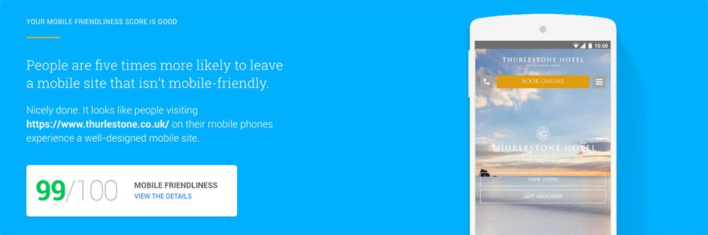 |
| Thurlestone Hotel has a great example of a mobile-friendly site. To test your site, click here. |
First impressions mean everything
- Tell users which screen orientation works best for viewing your site (landscape or portrait), but make sure content isn’t compromised in one particular view
- Make sure users never have to pinch, scroll side-to-side or zoom out to see your web pages
- Use a big, clear font
- Don't use Flash
- Don't use pop-ups
- Display the hotel address boldly
- Include click-to-call functionality, so potential guests can easily contact your property
- Include Google Maps integration, allowing people to see your location and helping guests to find their way back to your hotel
- Include local insights on things to do and places to eat
Can a user quickly achieve their goal?
- Keep menus short, sweet and easy to navigate
- Help users get back to the homepage easily by linking through your logo
- Are your links and buttons finger friendly? (Incorporate a ‘fat finger’ design)
- Have you placed your most important call-to-action button above the mobile fold?
- Make sure your site search is clearly visible
The booking experience must be quick and simple
- Can your booking process be simplified? Give this a critical rethink
- Provide a visual calendar for selecting dates
- Use existing information to maximise convenience. For example, auto-fill forms for returning users
- Forms or other windows must not open in a pop-up window or lightbox. These are bad for UX (user experience) and SEO
- Use third-party payment services if they help make conversion as easy as possible
Is your content made for the small screen?
- Again, is your content easy to read without excessive scrolling or zooming?
- Make sure your images and videos are optimised for mobile and load quickly
- Your room and facility descriptions must be short and to the point
- Add social sharing buttons to your content
It might seem like an overwhelming amount of things to consider, but a lot of these changes are very easy (and inexpensive) to implement. Most web developers are extremely well-versed in optimising websites for mobile users, and are more than capable of guiding you through this process.
Mobile is no longer the future of web browsing and booking, it’s a reality. Don’t get left behind.